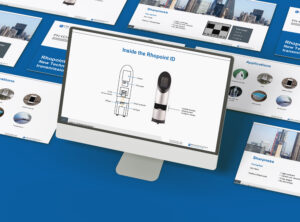
Sales deck that closes high-value deals
Project overview
Rhopoint Instruments’ sales team was pitching precision measurement instruments to technical decision-makers in R&D and Quality departments (these are significant investment decisions) but their in-house presentation wasn’t doing their technology justice.
The deck was functional but didn’t look professional enough for the calibre of deals they were closing, and more importantly, it wasn’t communicating the instrument’s capabilities in a way that resonated with technical buyers who needed to understand both how it works and why it matters for their specific applications.
What I created
I redesigned their sales presentation from the ground up, creating a professional deck that balanced technical depth with visual clarity.
This included a suite of bespoke diagrams that translate complex measurement technology, things like how light interacts with materials and specific measurement parameters, into clear, easy-to-grasp visuals.
Some of these diagrams I’d originally developed for the Rhopoint ID datasheet and they worked so well they made their way into the sales presentation, while others were created specifically for the slides to support the sales conversation.
Before & after: From functional to professional
The original presentation did the job, it had all the right information, but it wasn’t doing Rhopoint any favours when their sales team was sitting across from decision-makers comparing them to competitors.
The problem with the original:
- Slides were cluttered and text-heavy, making it hard for prospects to quickly grasp key concepts during presentations
- Technical diagrams were overly complex, forcing sales reps to spend valuable time explaining visuals instead of having conversations
- The overall look didn’t match the precision and quality of the instrument itself, which undermined confidence in high-value sales situations
What the redesign achieved:
- Clean, professional aesthetic that positions Rhopoint as the premium choice in their market
- Technical information presented in clear, scannable visuals that prospects can understand at a glance
- Confident visual hierarchy that guides prospects through complex information without overwhelming them
- A deck the sales team actually wants to present, rather than one they apologise for


The transformation wasn’t about making things “prettier”, it was about making the deck work harder in sales conversations.
When you’re asking prospects to invest in precision measurement equipment, your presentation materials need to inspire the same level of confidence as your technology.
Strategic design approach
Rather than text-heavy slides that overwhelm prospects, I focused on visual storytelling that helps R&D and Quality professionals quickly understand the technology without wading through paragraphs of specifications.
The design needed to match the precision of the instrument itself, polished, professional, and technically credible, while making complex information accessible during high-stakes sales conversations.
Custom diagrams: Making complex measurement technology visual
The technical nature of transparency measurement means there’s a lot of complex information to communicate, from how light interacts with different materials to the specific measurement parameters that matter for different applications.
Distance-dependent haze diagram
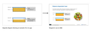
This diagram explains why the same plastic film can look completely clear when wrapped around a product but hazy when there’s an air gap, a concept that’s crucial for packaging manufacturers to understand but tricky to explain in words.
The visual makes it immediately obvious, with a real-world example (food packaging) that prospects can relate to their own applications.
Instrument component diagrams
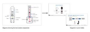
Technical buyers want to understand what’s inside the instrument and how it works.
Rather than expecting them to decipher generic technical schematics, these diagrams clearly label every component and show the light path through the system.
The same diagrams work across multiple contexts, from explaining the technology to demonstrating measurement principles, giving the sales team flexible visual tools for different conversation angles.
Visible transmission diagram

This one translates optical physics into something a non-specialist can grasp in three seconds: light goes in at 100%, the sample affects it, and 65% reaches the observer’s eye.
The flow-chart style shows exactly what the instrument measures and why it matters for quality control, without requiring prospects to understand the underlying science.
Rather than relying on generic technical illustrations or dense text explanations, these custom diagrams show exactly how the instrument works and why it matters for specific applications, making it easy for R&D and Quality professionals to understand the technology without wading through paragraphs of specifications.

The result
The sales team now presents with genuine confidence to high-value prospects.
The clearer visual presentation helps potential customers understand the instrument’s capabilities faster, which means more successful closes.
By making complex measurement technology accessible without dumbing it down, the presentation became an actual sales tool rather than just a slide deck, helping Rhopoint close deals with customers making significant equipment investments.