From Slide Deck to Storybook: Reimagining my own webinar as a journey, not a presentation
I redesigned my own webinar around a story-driven theme, so instead of just telling people how to fix their slides, I gave them an experience of what good learning design feels like.
Project overview
I’d run this webinar a few times already, and it worked. But “it worked” isn’t the same as “it stuck.” I wanted people to walk away remembering how it felt to sit through it, not just nodding along to another set of tips they’d forget by Friday. The real challenge wasn’t the content, it was proving, in real time, that design and storytelling can carry a message further than information alone ever will.
What I created
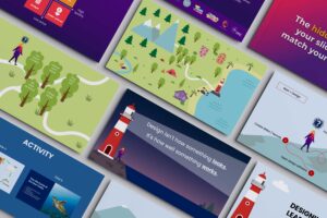
Instead of the usual slide-by-slide format, I built the whole webinar as a story. It opens with a book on a desk, the page turns, and the audience lands on a map which represents the same route most people take when they’re building their own training slides. From there, we travel through three key stops that mirror where people usually go wrong.
Custom illustrations
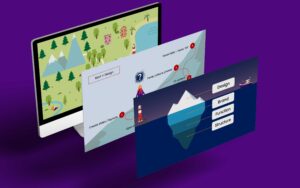
Each location on the map is a metaphor, not just a pretty backdrop. The mountains represent starting halfway through your own thinking instead of the beginning. The woods are what happens when you’re so deep in your own expertise you can’t see what your learner actually needs. The lighthouse is the reminder that you’re there to guide people, not just to look impressive. And underneath it all, an iceberg slide makes the point that great design is only the visible tip of a lot of invisible thinking.
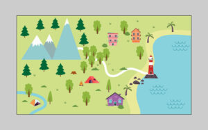
This is the opening reveal…the whole storybook world laid out at once, so people can see where the journey’s headed before they take a single step. The mountains, woods, and lighthouse aren’t just scenery; they’re a visual table of contents for the three struggles we’re about to walk through.
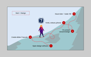
This is where chapter one lives. The numbered path shows the order most people actually work in: open the software, build the slides, THEN think about fonts and colours, then try to cram the content in around the design. It’s back to front, and that’s exactly the point I want to get across.
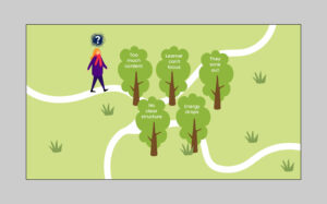
Chapter two. Each tree is a symptom of the same root problem: too much content, no clear structure. That happens when you design for what YOU want to say instead of what your learner needs to hear. The overwhelm is the message here.
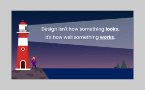
The turning point of the story. This is the line I want people to walk away with – that good design isn’t decoration, it’s direction. The lighthouse is the visual metaphor for being your learner’s guide instead of leaving them to find their own way.
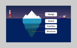
This is the “here’s what you don’t see” moment. Design is only the visible tip. Brand, function, and structure are doing the real work underneath. I use this to explain why good design takes longer than it looks like it should.
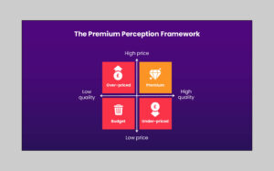
This is the payoff slide, where I connect everything back to business impact. It shows people exactly where they land depending on how their pricing matches their perceived quality, and why “premium” only happens when both are high.
Strategic design
Every visual choice ties straight back to the emotional experience of building slides…the overwhelm, the second-guessing, the “am I doing this right?” feeling most trainers know well. That’s deliberate. If I’m asking people to design with their learner’s experience in mind, my own webinar had to prove I practice what I preach.
The result
People don’t just take away three tips anymore, they remember the map, the mountains, the lighthouse, and why they matter. It’s become a talking point after the session, and it’s one of the clearest examples I can show a potential client of what “strategic learning design” actually looks like in practice, not just what it means in theory.