A trainer or course creator spends weeks, sometimes months, pulling together their programme.
You’ve got the slides done, the workbook’s looking decent and make everything look professional.
It goes out into the world and… it’s fine. People attend. Feedback forms come back okay. A few nice comments.
But the rebookings aren’t flooding in. The passive income is more of a passive trickle. There’s little rave reviews.
And the assumption, almost every time, is that it needs to look better. It doesn’t. Or at least, that’s not the whole story….
Looking good and working well are not the same thing
I’m a designer. I care deeply about how things look. But I’d be doing you a massive disservice if I just tarted things up and sent you on your way.
Because beautiful training materials sitting on top of a shaky foundation aren’t going to get you the ROI you’re after.
And ROI is what we’re talking about here, because it’s the whole point of why you’re launching some sort of training. You want repeat bookings, course completions and glowing referrals.
You want clients walking away from your session that actively send other people your way because what you taught them actually changed something for them.
This is the stuff that puts money in the bank consistently.
So if that’s what you want, then we need to talk about what’s going on underneath the surface of effective training.
The training iceberg nobody talks about
Think of your training materials like an iceberg.
Layer 1 is the Design.
The finished slides, resources and training. It’s what your audience sees, the layouts, the colours, the fonts, the pretty slides, the the bit above the water.
Yup, it matters. Design done well reduces friction and makes things easier to absorb. But it’s only first layer out of four.
Underneath the water, there are three more layers, and most people skip straight past them.
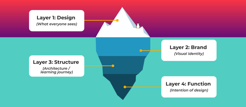
Layer 2 is Brand.
Not just slapping your logo on things, but making sure your visual identity is consistent enough that it builds trust rather than quietly undermining it.
People make judgements about your credibility in seconds. Your materials are part of that.
Layer 3 is Structure.
This is the architecture of your training. The sequence. The journey your learner goes on from where they are now to where you need them to get to.
Structure is what turns a collection of content into something people can actually follow and remember. Without it, your materials might cover everything but take people nowhere.
Layer 4 is Function.
And this is the one that separates impactful training from training that just looks like it should be impactful.
Every element, every diagram, every activity, every page of that workbook, should be there for a reason. Not because it looks good. But because it’s doing a job for your clients.
Why your training looks fine but isn’t landing
Most people are so focused on Layer 1 that Layers 3 and 4 barely get a look in. Which is exactly where the ROI is hiding.
It’s not because trainers and course creators don’t care about results. Of course you do. It’s because the surface stuff is visible and the deeper stuff isn’t. You can see when your slides look a bit naff.
You can’t always see when your content journey has a gap in it, or when your workbook activities aren’t actually reinforcing what you just taught.
Here’s a stat that should make everyone stop for a second…. research by 24×7 Learning found that only 12% of learners actually apply the skills from training they receive to their job. That’s not a design problem. That’s a structure and content problem.
What ends up happening is people spend hours moving things about in Canva at 11pm trying to make it feel more “professional” when the thing that actually needs attention is the structure underneath.
The design is the last layer, not the first. Putting it first is a bit like painting the walls of a house before you’ve laid the foundations.
What well-built training actually looks like in practice
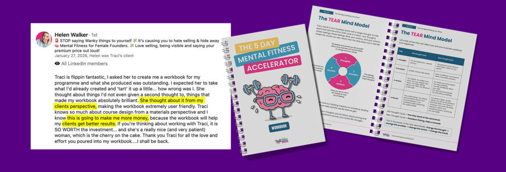
Helen Walker came to me to create a workbook for her programme. She expected me to take what she’d already put together and make it look better.
What she got instead was a complete rethink, not because what she had was wrong, but because there was so much more it could be doing.
We thought about it from her clients’ perspective. We looked at the flow, the structure, what each element was actually there to do.
The result wasn’t just a prettier workbook. It was, in Helen’s own words, something that was going to make her more money, because her clients would get better results from it.
This is the connection that people miss.
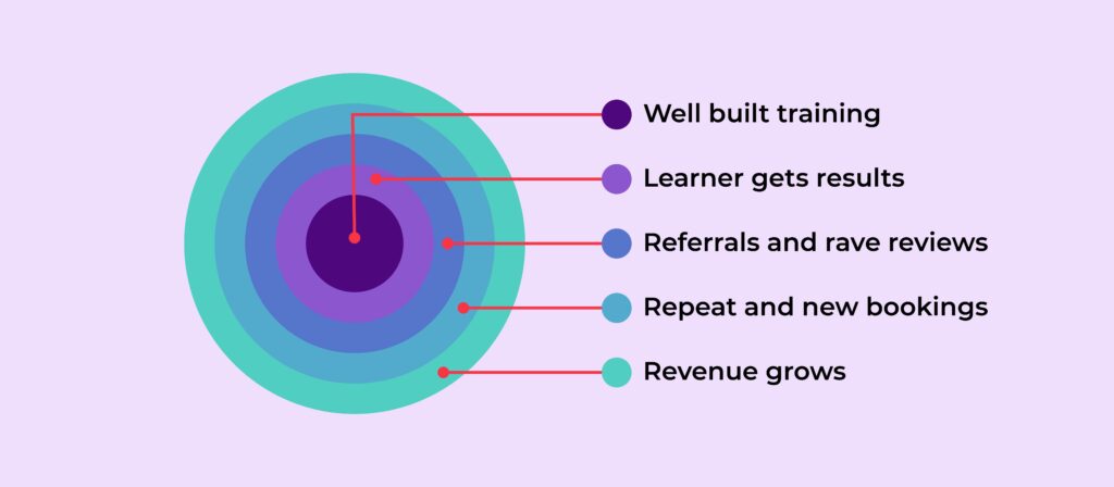
Your clients getting results isn’t just a lovely outcome. It’s your best marketing. It’s your referral engine.
It’s the reason someone books you again, recommends you to their network, leaves the kind of review that makes the next person a no-brainer yes.
Well-built training creates people who become your cheerleaders. And cheerleaders are worth a hell of a lot more than a nice-looking slide deck.
The real ROI of well-built training
Let’s just talk about this plainly for a minute because I think it gets a bit lost in the “good design matters” conversation.
Research shows that people forget 70% of new information within 24 hours if it’s not applied. So if your training isn’t built in a way that gets people actually using what they’ve learned, most of it is gone before they’ve even made it home.
But when your training is well built, people apply what they’ve learned. Not just in the session, not just in the week after, but weeks and months down the line because it actually landed with them.
That’s when you get the message that says “I just wanted to let you know…” and then something brilliant follows. That’s when someone tags you in a post about a win that started in your room.
That’s when someone becomes a repeat client, or sends three colleagues your way.
This is your ROI. Not just the invoice you sent.
The ripple effect that comes from training that was built to actually work, not just look the part.
So what does this mean for you?
If your training is going out into the world and not quite getting the response you hoped for, I’d encourage you to look beyond the surface.
Ask yourself honestly, does my content actually take my learner somewhere? Is there a clear journey? Does every piece of it earn its place?
Because you can’t design your way out of a content problem. And I say that as someone who really loves design.
The trainers and course creators who are consistently getting rave reviews, full cohorts, and passive income that actually feels passive… they’ve sorted the foundations first. The design is the final layer, not the first.
Get the structure right. Get the content working hard. Make sure every element is doing something for your learner. Then focus on the design and how it looks.
Want to know if your training materials are actually doing their job?
Download my free guide, The Four Layers of Effective Training Materials, and find out exactly what’s working and what’s missing.