Looks aren’t what they’re cracked up to be
This is what normally confuses people and catches them out, because we’ve all been taught that if something looks good, it IS good.
What’s going on underneath two equally nice-looking decks can be completely different….what if the thing that makes an impact with your clients has eff all to do with how your slides look?
And instead its how well they help someone learn and remember what you’ve taught them in your workshop or course?
Which slide is best?
In a recent webinar of mine, I showed my audience two slides on the same topic and asked them which one they thought was better for getting the info across.

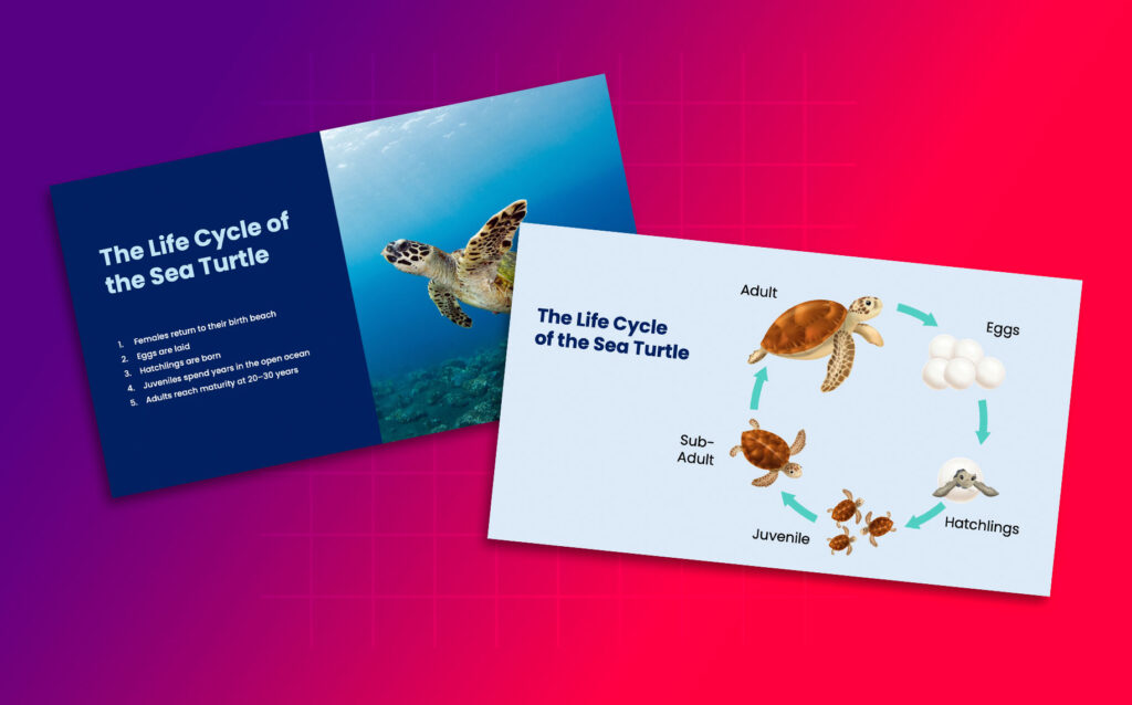
Slide one’s got a lovely photo of a turtle swimming, and bullet points next to it running through the whole lifecycle, eggs, hatchlings, juveniles, adults.
Slide two’s an infographic. A circle with the same four stages, arrows looping round to show it’s continuous, the turtles growing up and coming back to the same beach to lay their own eggs. The only text on it is the title and a word or two next to each stage.
My audience were split into two pretty equal camps of which slide was best (especially as I was a bit sneaky and made them both look good)!
Slide 1 with the beautiful photo looks impressive and polished.
You could even argue that slide 2 with the infographic doesn’t look ‘as designed’.
But in a training session they have a job to do which is helping to teach people something. THIS is what we need to remember when creating slides.
What happens when you talk over a slide
What changes is what happens when you (as a trainer) present your slides to your clients and start talking.
With slide one, the trainer’s competing with their own slide. They’ll be using the slide like their notes and reading out all the bullet points. Whilst they are speaking, the audience will be reading the text.
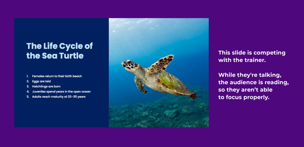
And because we read quicker and are focused on what we are reading, we won’t be properly listening and could miss something really important as our focus isn’t in the right place.
And there’s a proven reason why this can be an issue…
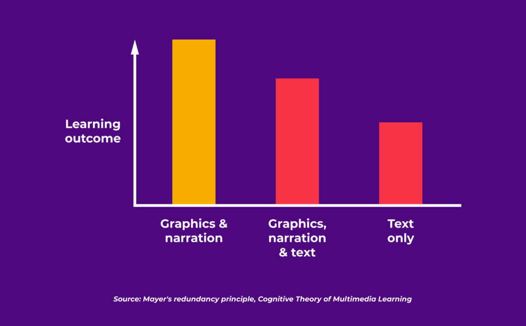
…It’s called the redundancy principle, it comes from Richard Mayer’s work on multimedia learning, and it says people learn better from graphics and narration together than they do from graphics, narration, and on-screen text all at once.
Three inputs competing for the same bit of attention doesn’t add up to more learning. It adds up to less.
What’s different about slide two?
Which brings me back to slide two. There’s nothing on it to compete with the trainer.
The design is minimal but visually explains the lifecycle whilst the trainer can talk about each stage in detail. It complements them rather than competes with them.

The audience’s focus will be on the trainer and learn more rather than their focus being on reading the slide.
That’s the actual difference between the two.
Not the visuals themselves, rather HOW the slide gives the right information.
Do your slides complement you or compete with you?
This changes how I look at every slide I create. I ask myself, “is this trying to do the talking, or is it making room for the person who’s meant to be talking?”
It’s a small question. But it’s the one that decides whether your audience walks out remembering what you’ve taught them, or just remembering that the slides looked nice.
If you’ve got materials that look good and you’re still not sure that they’re doing what they should, that question’s probably worth sitting with for a minute.
Not “does this look professional,” but “what is this slide asking the person looking at it to do?” Read it? Listen? Both at once?
A quick way to check your own slides
Next time you’re building a slide, try this before you touch a single design element.
Look at what you’ve written and ask yourself:
“If I took this slide away completely and just talked, would my audience still get this?”
If the answer’s yes, your slide doesn’t need to be doing the explaining, it just needs to be holding the shape of what you’re sayingA visual prompt rather than a script.
If the answer’s no, if you need the detail on the page for it to make sense, that’s fine too, just don’t expect your audience to read it and listen to you at the same time. Pause. Let them read. Or even add in some animation to stagger the information and how it appears.
Either way works. What doesn’t work is asking people to do both at once and hoping it lands. Design the slide around the job it’s actually got to do, then make it look good. Not the other way round.
Want to know if your training materials are actually doing their job?
Download my free guide, The Four Layers of Effective Training Materials, and find out exactly what’s working and what’s missing.