
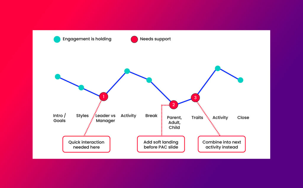
You know that feeling when you’ve looked at your own slides so many times you can’t actually see them anymore?
The curse of knowledge is real…and it’s why you can’t see weak points in your deck, why you keep tweaking the design as something doesn’t feel quite right and why you keep moving the order about, adding stuff in and taking stuff out.
It’s why taking a step back and looking at your deck objectively can make such a difference. But HOW TF do you do this when you are so close to it?
For me, I have created my own process using my DECKDATA framework after being inspired this after reading Nancy Duarte’s book Resonate and watching her Ted Talk.
She looks at famous presentations such as Martin Luther King’s “I Have a Dream” speech, and mapped the structure of them into a visual graph… plotting the shape of how the presentation moved, where it built tension, where it released it, where it landed its big moments.
I started doing my own version of this with client decks. Not to analyse the design (that’s a separate job), but to strip everything back to the content and structure and turn it into actual data that you can look at objectively and use to improve your slides flow and structure.
What the data shows
When I map a deck, I’m tracking a mix of things:
- Energy levels across the deck
- How complex or dense each slide is
- How much cognitive load it’s asking of the audience
- Where the audience actually sits, beginners or advanced
- What they need from this specific session
- How they learn best
The point is you take yourself out of the equation for a minute. You’re not looking at “do I like this slide” or “does this look nice”… you’re looking at the data and asking where an audience might disengage, where they’d need a breather, where you’ve thrown too much at them in one go.
What this looks like in practice
I did this with a client’s deck recently (details changed here for confidentiality, but the pattern’s real).
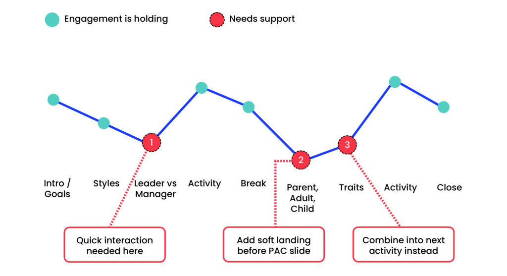
When I turned it into data, three spots jumped out straight away.
- Spot 1 needed a quick bit of interaction to bring the energy back up before it dropped further.
- Spot 2 needed a softer landing before moving into a fairly personal, reflective section… going straight from an activity into something more introspective was too abrupt.
- Spot 3 had an activity that would’ve worked better folded into the next one, rather than sitting on its own and breaking the flow.
None of these are things you’d immediately catch by scrolling through the deck. They only show up when you translate the whole thing into data and step back from it.
How data improves your deck
This isn’t really about slides or the design. It’s about the fact that when you’re so close to your own material, you lose the ability to see it the way your audience will experience it in real time.
You know what the whole outcome is and the point of each slide and the content. They don’t. And the gaps that feel invisible to you can be exactly where your audience mentally checks out and start planning what they’re going to have for dinner. Or having a sneaky secret scroll on their phone.
Next time you’re flicking through your own deck, ask yourself…
- Where does the energy dip? Is there a stretch of slides that all look and feel the same, so the eye just glazes over?
- Where are you cramming five ideas onto one slide because you have so much you need to say and want to give value?
- Where would someone who’s never heard this content before start to switch off?
- Where’s the breathing room? Not every slide needs to hit hard… sometimes the pace itself is what keeps people with you.
Every deck has its own data. Yours included… even if you can’t see it yet.
Interested in what your deck data could look like? Get in touch.