
Colour contrast
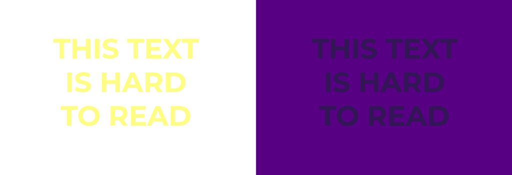
Make sure your text stands out clearly against its background. Low contrast like light yellow text on a white background or dark text on a dark background, is really hard to read.
It’s not just good design practice, either.
Low contrast makes text difficult or impossible to read for anyone with low vision or colour blindness.
So if your materials and slides use low contrast text, there’s a good chance people will struggle to read it.
An easy way to test it is to zoom out of your design to 50% or less and see if you’re still able to read your text clearly.
Font choice
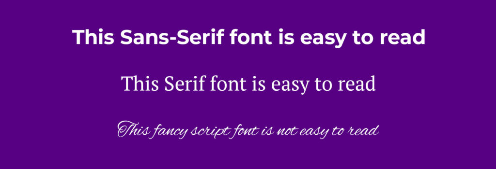
Font choice matters. Opt for a font that’s easy to read and legible over something stylised, even if the stylised option looks nicer on the page.
What’s perfectly legible up close, on your laptop, can turn into a squint from the back of a room once it’s projected at a distance.
Popular, easy to read fonts include sans-serif options like Calibri, Helvetica or Arial, and Serif fonts like Times New Roman or Georgia. They may not be the fanciest choices but they’ll be the easiest to read!
Print sizing and screen sizing follow different rules, so your workbook will need its own check, separate from your slides. As a general rule, avoid using text under 18pt on slides and 10pt on anything printed.
Alt text
Alt text is behind-the-scenes text added to an image, describing what it shows to anyone using a screen reader.
It’s needed on any image that’s carrying information that’s crucial to what you’re teaching such as a chart with figures in it, a graph or a diagram explaining a process.
Without it, a screen reader user misses that information completely.
It isn’t meant for decorative elements as this will create confusion for someone using a screen reader. A stock photo included just for visual interest, a background flourish, a decorative border… none of that is adding information, so it doesn’t need a description.
You can add alt text easily in Canva, Adobe InDesign, PowerPoint and most other design software.
Don’t rely on colour alone
Some colours that look distinct to you can appear as the same tone to someone with colour blindness.
Reds, oranges and greens are the classic example… if you’re using them to show right and wrong answers, or colour-coding a chart with nothing else to support them, anyone with colour blindness or low vision will not be able to easily get the right information.
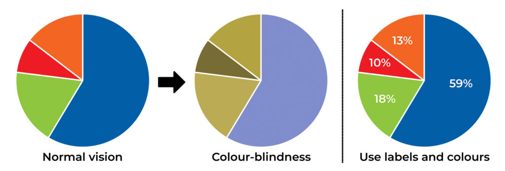
Take the pie chart above, labelled “normal vision.” It uses four colours… red, orange, green and blue… with nothing else to tell the segments apart.
Now look at the middle chart, labelled “colour-blindness,” which shows how that same chart can appear to someone with certain types of colour blindness. The orange and green segments, so clearly different in the first chart, become almost indistinguishable.
If someone were relying on colour alone to read that chart, they’d have no way of knowing which segment was which.
The fix is the one shown in the third pie chart… pair colour with a label so the meaning still comes through even if the colour doesn’t.
Remember to label your diagrams and charts with text as well as colour so it’s easy for everyone to understand.
Cognitive load
This isn’t purely an accessibility point on its own, it’s good design practice also, but it belongs here because it affects far more people than you’d think.
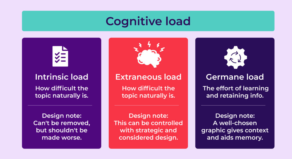
Cognitive Load Theory, developed by researcher John Sweller and now well-established in instructional design, breaks the mental effort involved in learning into three parts:
- Intrinsic load – the difficulty that’s naturally in what you’re teaching, regardless of how well or badly you present it. Think the complexity of the topic itself, or how many steps are involved in the task you’re walking someone through. Some things are just harder than others, and no amount of clever design changes that… though good design can stop it getting worse.
- Extraneous load – the extra effort someone has to put in just because of how the information’s been presented, on top of the difficulty of the topic itself. This is where design does the most damage, or the most good. Irrelevant content, clutter, a slide that’s badly structured, an image and a block of text fighting for the same space… all of that adds effort that has nothing to do with what you’re teaching.
- Germane load – the effort it takes to process the information and remember it. Think long-term memory being activated, or someone building a mental framework for the topic as they go. This is the “good” kind of effort! You can use design to help your audience by using relevant, well-chosen graphics such as a diagram or an image tied closely to the topic.
A slide with too much text, several bullet points, an image and a diagram all fighting for space is a classic case of extraneous load… effort your audience is spending just trying to work out what they’re looking at, before they’ve even got to the content itself.
There’s also growing research interest in how this affects neurodivergent learners specifically, with early findings suggesting cluttered or overstimulating material can add an even heavier load for some.
Give the information room to breathe on your slides and materials, and you’re not just being considerate, you’re helping your clients to learn better.
Know your audience, and give them options
It’s worth building in a simple way for people to request additional support before a session.
In practice, the most common asks tend to be one of three things:
- A larger print version for anyone with low vision
- An electronic version that works with a screen reader or text-to-speech tool
- An audio version they can listen to instead of reading.
It’s also worth mentioning…if you’re bidding on corporate or public sector training contracts, accessibility isn’t just a nice-to-have anymore. A lot of procurement has accessibility requirements written into the spec.
Accessibility tools
If you want to check that your materials are accessible, there are quite a few tools out there you can use;
- Canva has a built-in accessibility checker: File > Accessibility > Check Design Accessibility that flags contrast, font size and missing alt text issues directly in your design
- Microsoft has its own built in checker: In Word, Excel, or PowerPoint, navigate to Review > Check Accessibility
- Adobe Acrobat Pro: Open the PDF and go to All Tools > Prepare for Accessibility > Check for Accessibility.
When you’re next creating your materials, build accessibility in with your audience in mind from the start. And remember to ask in advance whether anyone might need an alternative format, so you’re prepared.
A comparison
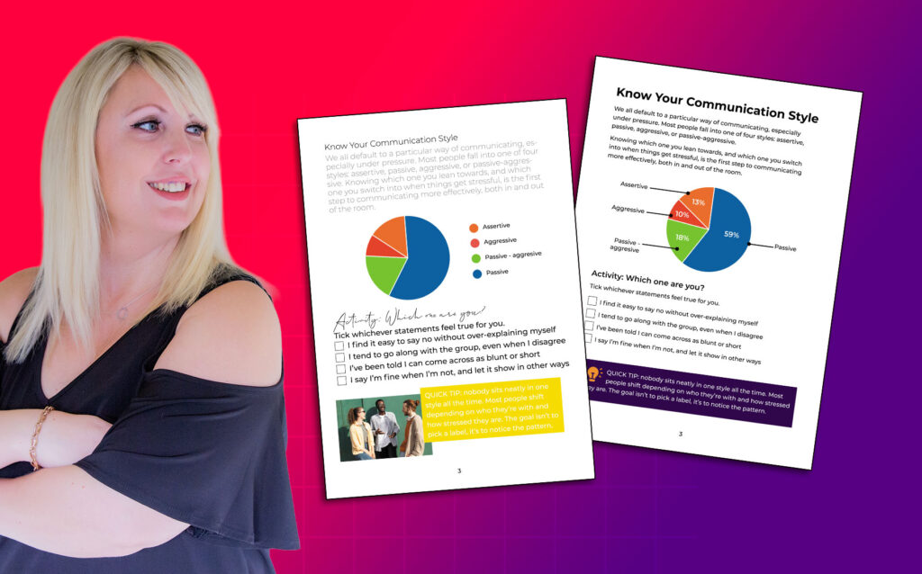
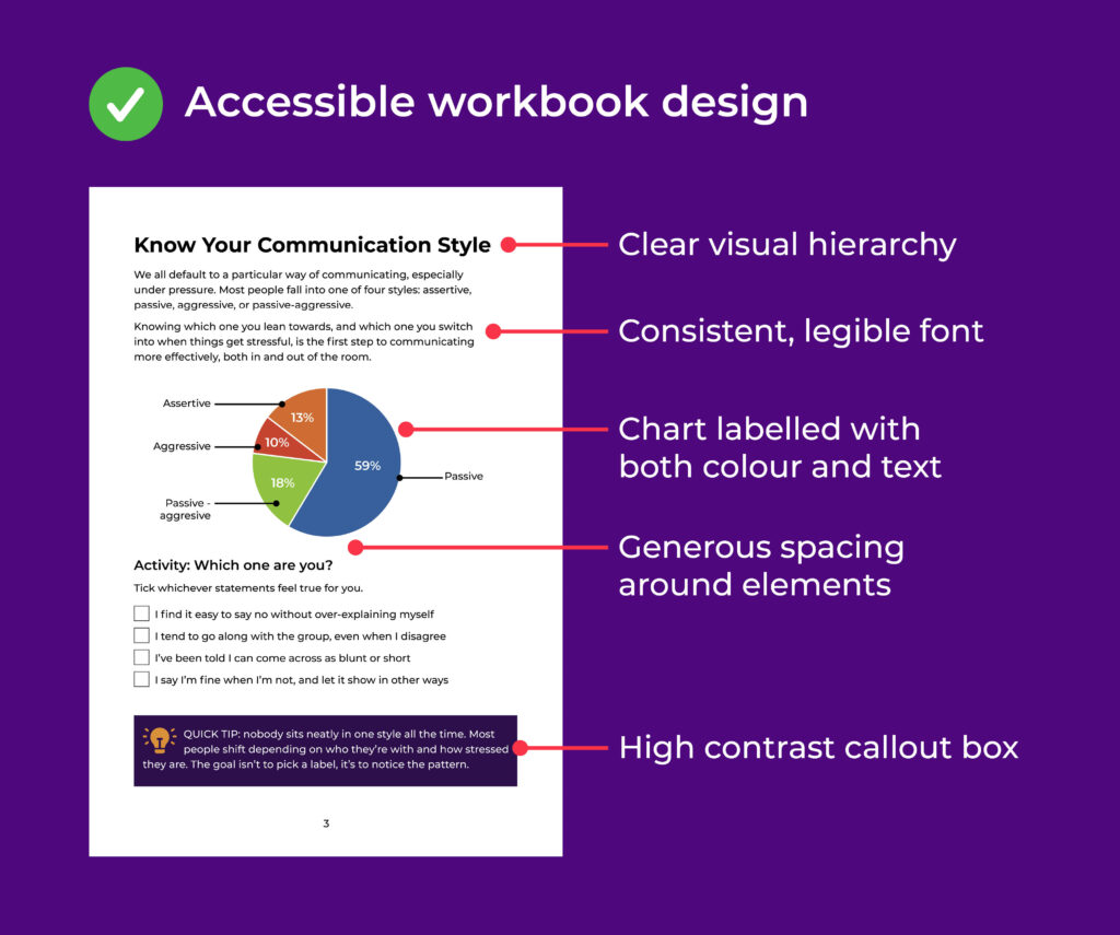
Let’s look at two examples of the same workbook page. One’s built with accessibility in mind, the other isn’t (both contain the same content).
This first version shows the page built with accessibility in mind: clear heading structure, strong contrast, a chart labelled with both text and colour, and plenty of space for each section to breathe.
This second version shows the same page without those considerations: low-contrast text, a decorative script font, a chart that relies on colour alone, and everything crammed together with little room to breathe.
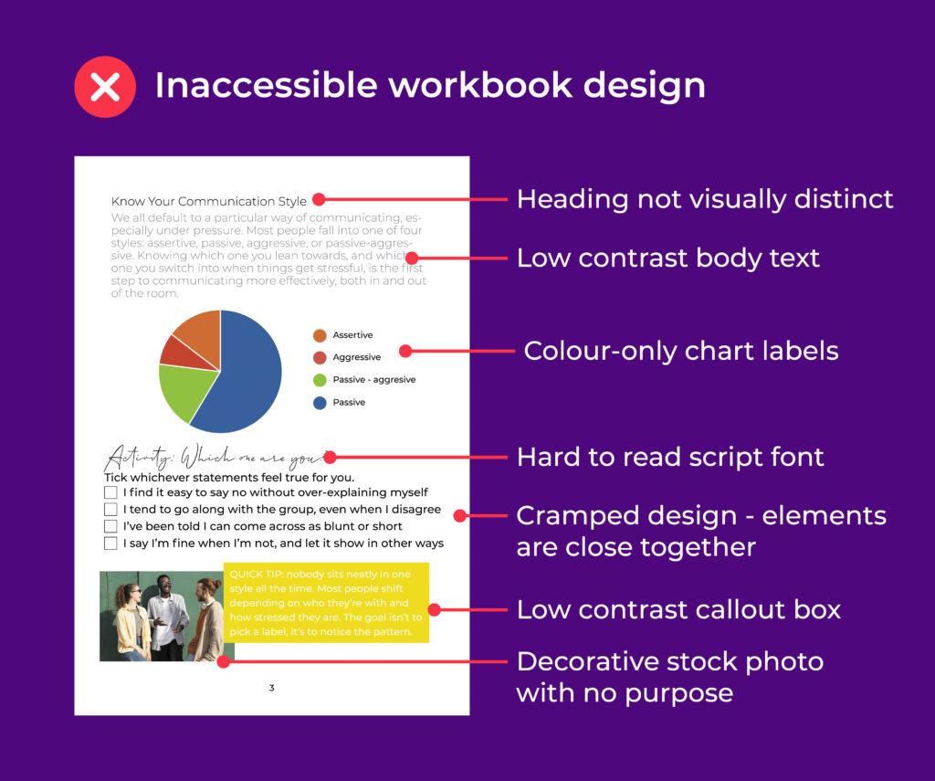
Notice that the accessible version doesn’t have as much styling applied, and doesn’t use extra imagery.
That’s deliberate… it’s function over frills. That doesn’t mean you can’t have decorative elements as part of your brand, you absolutely can, they just can’t come at the expense of how well the page actually works for the person reading it.
Conclusion
The difference between those two pages isn’t just about looking polished. Accessible design is good design practice full stop, but it also directly affects who your materials actually work for.
If you clients have a learning need, a visual impairment, or any other access requirement, and your materials aren’t built with that in mind, they’re not getting a slightly worse version of the same experience.
In a lot of cases, they’re only getting part of the information. A chart they can’t distinguish, a heading a screen reader skips over or text that’s too much effort to read.
And that matters for outcomes. If someone’s only absorbing part of what’s in front of them, that’s what they’ll remember, and that’s what they’ll walk away being able to apply.
Building accessibility in from the start isn’t just about being considerate, it’s about making sure everyone in the room gets the full thing you actually built for them.
Note – I am slowly working in the background to update my website to be more accessible, please be patient with me whilst I do this and please do contact me if you need extra support. I am always learning and never want to intentionally exclude anyone.